
Introduction
Project management is a complex and multifaceted discipline, requiring a variety of tools and techniques to ensure successful delivery. One such tool that has become increasingly popular in the Agile project management methodology is the burndown graph. This visual representation of a project’s progress can provide invaluable insights into the team’s productivity, the project’s status, and potential risks or challenges that may arise.

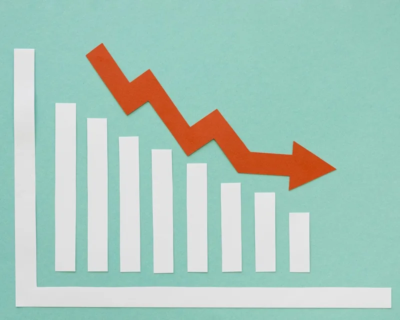
What is a Burndown Graph?
A burndown graph is a graphical representation of the remaining work in a project or sprint over time. Teams typically use it in Agile project management, working in short, iterative cycles known as sprints. The burndown graph shows the total amount of work remaining, usually measured in story points or hours, plotted against the time elapsed or the number of days in the sprint.
What does a burndown graph show?
The burndown graph provides a clear and concise way to visualize the progress of a project or sprint. It shows the team’s progress in completing the planned work. Also, monitor the work completion rate and identify any deviations from the planned trajectory. You can use this information to identify potential issues, adjust the project plan, and ensure the team stays on track to meet their goals.
Importance of the Burndown Graph in Agile Project Management
In Agile project management, the burndown graph is a crucial tool for tracking and managing the progress of a project or sprint. It helps the team and stakeholders understand the current status of the project and identify potential bottlenecks or risks. Moreover, to make informed decisions about the allocation of resources and the scope of the project.
It also serves as a communication tool. It allows the team to share progress updates with stakeholders and collaborate more effectively. By providing a visual representation of the work remaining, the burndown graph can help the team identify areas where they may need to adjust their approach or seek additional support.
How to create a Burndown Graph
Creating a burndown graph is a straightforward process, and many Agile project management tools have built-in functionality to generate and display these graphs. The basic steps to create one are:
- Identify the total amount of work to be completed, usually measured in story points or hours.
- Determine the timeframe for the project or sprint, such as the number of days or weeks.
- Plot the total amount of work remaining on the vertical axis and the time elapsed on the horizontal axis.
- As the team completes tasks, update the graph to show the remaining work.
The resulting graph will show a line that slopes downward as the team completes the work, ideally reaching zero by the end of the sprint or project.
Understanding the components of a Burndown Graph
A typical burndown graph consists of several key components:
- Ideal Burndown Line: This line represents the planned rate of work completion. Assuming the team is able to complete the work at a consistent pace.
- Actual Burndown Line: This line represents the team’s actual progress in completing the work. It may deviate from the ideal burndown line.
- Remaining Work: The vertical axis shows the total amount of work remaining, typically measured in story points or hours.
- Time Elapsed: The horizontal axis shows the time elapsed, usually in days or weeks.
By understanding these components, project managers and team members can interpret the data and make informed decisions about the project’s progress.
Interpreting the data from a Burndown Graph
Interpreting the data from a burndown graph can provide valuable insights into the project’s progress and potential challenges. Here are some key things to look for:
- Deviations from the Ideal Burndown Line: If the actual burndown line is above the ideal line, it may indicate that the team is falling behind on their planned work. Conversely, if the actual line is below the ideal line, it could mean that the team is completing work faster than expected.
- Sudden changes in the slope of the Actual Burndown Line: This may indicate a change in the team’s productivity. Also it may indicate the introduction of new tasks or challenges.
- Flat or horizontal sections of the Actual Burndown Line: This may indicate that the team is stuck or is not making progress on the remaining work.
By analyzing these patterns and trends, project managers can make informed decisions about adjusting the project plan, allocating resources, or addressing any underlying issues that may be impacting the team’s progress.
What is burndown vs Gantt chart?
While both the burndown graph and the Gantt chart are tools used in project management, they serve different purposes and provide different types of information.
The Gantt chart is a more traditional project management tool that provides a detailed, timeline-based view of the project’s tasks, dependencies, and milestones. It is typically used for more complex, waterfall-style projects where the scope and timeline are well-defined upfront.
In contrast, the burndown graph is more commonly used in Agile project management. In these, the focus is on iterative, incremental delivery. This graph provides a high-level, visual representation of the team’s progress in completing the planned work. Rather than a detailed timeline of tasks.
The key differences between the burndown graph and the Gantt chart are:
- Focus: They focus on the remaining work, while Gantt charts focus on the overall project timeline and dependencies.
- Timeframe: They are typically used for short, iterative sprints, while Gantt charts are used for longer, more complex projects.
- Visualization: Burndown graphs provide a simple, intuitive visual representation of progress, while Gantt charts offer a more detailed, timeline-based view.
- Flexibility: Burndown graphs are more flexible and can be updated more easily as the project progresses. While Gantt charts require more upfront planning and are less adaptable to changes.
Both the burndown graph and the Gantt chart have their place in project management, and many teams use a combination of these tools to track and manage their projects effectively.

Common challenges and how to overcome them when using a Burndown Graph
While the burndown graph is a powerful tool for tracking project progress, several common challenges may arise when teams utilize it. Firstly, inaccurate or incomplete data can distort the graph’s depiction of the project’s status if estimations are off or updates are irregular. To mitigate this, establishing clear processes for estimating and tracking work and ensuring regular updates are essential. Additionally, misinterpretation of the graph is a concern, as its complexity may hinder understanding among team members. Offering training and guidance on interpreting the graph and ensuring stakeholder comprehension can help alleviate this challenge.
Resistance to change is another issue teams may encounter, whether due to unfamiliarity or preference for traditional tools. Clear communication about the benefits and providing support and training can facilitate adoption. Moreover, the lack of alignment with other project management tools can hinder effectiveness. Seamless integration with existing tools and processes is crucial for overcoming this challenge. By addressing these common hurdles and implementing best practices for using the burndown graph, teams can maximize its benefits and enhance overall project management efficiency.
Tools and software for creating and analyzing Burndown Graphs
There are a variety of tools and software available that can help teams create and analyze burndown graphs. Some of the most popular options include:
- Agile Project Management Tools. Many Agile project management tools, such as Metridev, have built-in functionality to generate and display burndown graphs. These tools often integrate with other project management features, making it easy to track progress and identify issues.
- Spreadsheet Software. Tools like Microsoft Excel and Google Sheets can be used to create custom burndown graphs. While this may require more manual effort, it can provide more flexibility in terms of customization and analysis.
- Dedicated Burndown Graph Tools. There are also specialized tools and software that are designed specifically for creating and analyzing burndown graphs. For instance, BurndownCharts.net.
- Business Intelligence and Data Visualization Tools. Tools like Power BI can be used to create more sophisticated and interactive burndown graphs,. This allows for deeper analysis and reporting.
When selecting a tool or software for creating and analyzing burndown graphs, teams should consider factors such as ease of use, integration with other project management tools, data visualization capabilities, and overall cost and scalability.
Best practices for using Burndown Graphs effectively
To get the most out of using a burndown graph, teams should follow these best practices. Firstly, establish clear goals and metrics by defining the project or sprint objectives and determining appropriate metrics, such as story points or hours. These help to ensure the burndown graph provides meaningful and actionable data. Additionally, maintaining accurate and up-to-date data is crucial. The team must consistently update the burndown graph with precise information about the remaining work and work completed to reflect the project’s progress accurately. Furthermore, regularly reviewing and analyzing the graph is essential. Scheduling periodic reviews helps identify trends, patterns, and potential issues. They help to inform decision-making and allowing for necessary adjustments to the project plan.
Moreover, effective communication is vital. Using the this graph as a tool to share progress updates with stakeholders and team members ensures everyone understands how to interpret the graph and what the data signifies. Integrating the burndown graph with other project management tools. For instance, task management systems or project planning software, provides a comprehensive view of the project’s progress. Finally, continuously improving the process by regularly reviewing the burndown graph’s effectiveness and making necessary adjustments. These can be based on feedback from team members and stakeholders ensures ongoing enhancement. By following these best practices teams can ensure that the burndown graph is a valuable and effective tool for tracking and managing their projects.

Conclusion
The burndown graph is a powerful tool for tracking project progress in Agile project management. By providing a clear, visual representation of the remaining work and the team’s progress, the burndown graph can help project managers and teams identify potential issues, make informed decisions, and ultimately deliver successful projects.
To learn more about using other Agile project management techniques, read our article Fibonacci Sequence Story Points: For Agile Project Management.


Leave a Reply