Introduction
In the world of engineering, where complex data and intricate processes are the norm, having a clear and concise overview of information is crucial. This is where dashboard engineering comes into play. Dashboard engineering is the practice of creating data visualization tools that provide engineers with a comprehensive view of their projects, processes, and metrics. These dashboards serve as a central hub for engineers to monitor, analyze, and make data driven decisions. In this article, we will explore their role in the field of engineering and the importance of data visualization. Also we’ll look into the benefits of using an engineering analytics dashboard, and the key features to look for in a dashboard engineering tool.

What is Dashboard Engineering?
Dashboard engineering involves the creation and design of interactive and visually appealing dashboards. They display relevant data and metrics in a clear and concise manner. These dashboards serve as a bridge between engineers and data, allowing them to monitor the performance of their projects, identify trends and patterns, and make informed decisions. By presenting data visually, dashboard engineering simplifies the complex information and provides engineers with a holistic view of their projects.
The Role of Dashboard in Engineering
In engineering, dashboards play a pivotal role in providing engineers with real-time insights into their projects and processes. They act as a window into the performance of various parameters, such as production output, quality metrics, and operational efficiency. By consolidating and presenting this data in a visual format, dashboards enable engineers to quickly identify bottlenecks, anomalies, and areas for improvement. With a dashboard, engineers can monitor key performance indicators (KPIs), track progress, and take proactive measures to optimize their operations.
The Importance of Data Visualization in Engineering
Data visualization is a powerful tool that enhances the understanding of complex data sets. In engineering, where data is abundant and often convoluted, effective data visualization is essential. By representing data visually through graphs, charts, and other visual elements, engineers can easily interpret and analyze the information. This enables them to identify patterns, trends, and outliers that might otherwise go unnoticed. Moreover, data visualization allows engineers to communicate their findings and insights effectively to stakeholders, facilitating better decision-making and collaboration.
Benefits of Using an Engineering Analytics Dashboard
Using an engineering analytics dashboard offers numerous benefits to engineers and organizations alike. Firstly, it provides real-time visibility into the performance of projects, processes, and metrics. This allows engineers to identify issues and take corrective actions promptly, minimizing the impact on productivity and quality. Secondly, an engineering analytics dashboard facilitates data-driven decision-making by presenting information in a clear and concise manner. Engineers can easily compare different data sets, track progress, and make informed choices based on the insights provided by the dashboard. Lastly, an engineering analytics dashboard fosters collaboration and transparency among teams by providing a centralized platform for sharing and accessing data. This improves communication, enhances problem-solving capabilities, and promotes a culture of data-driven decision-making.
Types of Data Visualizations for Engineering Dashboards
When it comes to engineering dashboards, there are several types of data visualizations that can be employed to present information effectively. Line charts are commonly used to display trends and variations over time, making them ideal for monitoring processes and performance. Bar charts are useful for comparing different data sets or categories, such as production output across different shifts or departments. Heatmaps and scatter plots are effective for identifying correlations and relationships between variables. Additionally, gauge charts are commonly used to represent KPIs and provide a quick snapshot of performance. The choice of data visualization depends on the specific information being conveyed and the intended audience.

What are the Metrics of a Dashboard?
A well-designed engineering dashboard should include a set of key metrics that are relevant to the specific project or process being monitored. These metrics act as performance indicators and enable engineers to assess the health and progress of their projects. Some common metrics that can be included in an engineering dashboard are production output, cycle time, quality metrics, equipment utilization, downtime, and customer satisfaction. It is important to select metrics that align with the goals and objectives of the project and provide meaningful insights into its performance.
Key Features to Look for in a Dashboard Engineering Tool
When selecting a dashboard engineering tool, there are several key features that engineers should consider. Firstly, the tool should offer a wide range of data visualization options, allowing engineers to present information in a visually appealing and informative manner. Secondly, the tool should provide real-time data connectivity, enabling engineers to monitor and analyze data as it is generated. Thirdly, the tool should have the ability to integrate with existing systems and databases, ensuring seamless data flow and accessibility. Lastly, the tool should have user-friendly interface and customization options, allowing engineers to tailor the dashboard to their specific requirements and preferences.
What are 3 Benefits of a Dashboard?
The use of a dashboard in engineering provides three main benefits. Firstly, it improves visibility and transparency by centralizing relevant data and metrics in one place. This allows engineers to have a comprehensive view of their projects, making it easier to identify issues, track progress, and make informed decisions. Secondly, a dashboard enhances efficiency by automating the process of data collection, analysis, and reporting. Engineers can save time and effort by accessing real-time data and pre-built visualizations, allowing them to focus on problem-solving and optimization. Lastly, a dashboard promotes collaboration and communication among teams by providing a shared platform for data sharing and analysis. This fosters a culture of teamwork, knowledge sharing, and continuous improvement.
How to Build an Effective Engineering Analytics Dashboard
Building an effective engineering analytics dashboard requires careful planning and consideration. Firstly, engineers should identify the key metrics and data sources that are relevant to their projects or processes. This involves understanding the goals, objectives, and requirements of the project and determining the information needed to monitor and assess its performance. Secondly, engineers should select appropriate data visualization techniques that effectively represent the chosen metrics. This includes choosing the right charts, graphs, and visual elements that provide clarity and insights. Thirdly, engineers should ensure that the dashboard is user-friendly and intuitive, allowing easy navigation and interaction. Lastly, engineers should regularly review and update the dashboard to ensure its relevance and effectiveness.

Best Practices for Designing a Dashboard for Engineering Data
Designing a dashboard for engineering data requires adherence to best practices to ensure its usability and effectiveness. Firstly, engineers should prioritize simplicity and clarity in the design, avoiding clutter and unnecessary elements that may distract from the information being presented. Secondly, engineers should use consistent colors, fonts, and styles to create a visually cohesive and professional-looking dashboard. This improves readability and enhances the overall user experience. Thirdly, engineers should consider the target audience and their specific needs and preferences when designing the dashboard. Tailoring the dashboard to the user’s requirements increases usability and engagement. Lastly, engineers should regularly gather feedback and iterate on the design to continuously improve the dashboard’s effectiveness and usability.
What is a Dashboard in Software Development?
In software development, a dashboard refers to a visual interface that provides an overview of the performance and status of a software application or system. It presents real-time data and metrics related to the application’s performance, such as response time, error rates, and user activity. A software development dashboard enables developers and stakeholders to monitor the health and progress of the application, identify issues, and make data driven decisions. It serves as a communication tool between developers, testers, and other stakeholders, facilitating collaboration and problem-solving.
What is a Developer Dashboard?
A developer dashboard is a specialized dashboard designed specifically for developers. It provides real-time insights into the codebase, build status, test results, and other relevant metrics. A developer dashboard allows developers to monitor the health and stability of the code, track the progress of their tasks and features, and identify and fix issues promptly. It promotes transparency, accountability, and collaboration among developers, enabling them to work more efficiently and effectively.
Tools and Resources for Dashboard Engineering
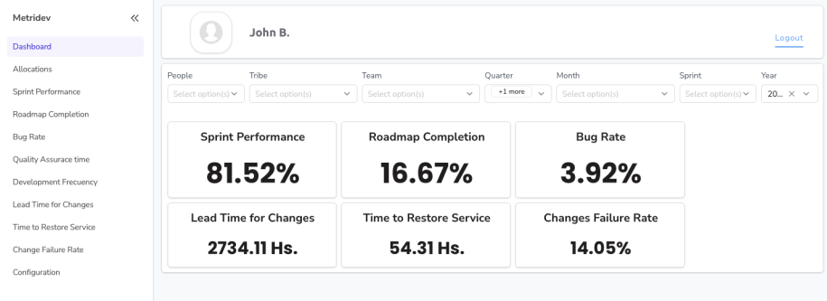
There are several tools and resources available for dashboard engineering that facilitate the creation and design of effective dashboards. Some popular dashboard engineering tools include Metridev, Tableau, Power BI, D3.js, and Google Data Studio. These tools offer a wide range of data visualization options, connectivity with various data sources, and customization features. Additionally, there are numerous online tutorials, courses, and communities dedicated to dashboard engineering that provide guidance, inspiration, and best practices for creating impactful dashboards.
What is a Tech Dashboard?
A tech dashboard, also known as a technology dashboard, is a specialized dashboard that provides insights and metrics related to the performance and health of technology infrastructure and systems. This includes metrics such as server uptime, network latency, bandwidth utilization, and security incidents. A tech dashboard enables IT administrators and technology teams to monitor the status and performance of their infrastructure, identify potential issues, and take proactive measures to ensure optimal performance and reliability.

Conclusion: Harnessing the Power of Data Visualization in Engineering
In conclusion, dashboard engineering plays a crucial role in the field of engineering by enabling engineers to make data-driven decisions, monitor project performance, and optimize processes. The power of data visualization cannot be overstated, as it simplifies complex data sets and enhances understanding. By using an engineering analytics dashboard, engineers can unlock numerous benefits, including real-time visibility, data-driven decision-making, and improved collaboration. When building an effective engineering analytics dashboard, engineers should consider key features, metrics, and best practices to ensure its usability and effectiveness. By harnessing the power of data visualization, engineers can drive innovation, improve efficiency, and achieve success in their engineering endeavors.
Explore the possibilities and unlock the power of data visualization in your engineering projects. We encourage you to read our article about DevOps Lifecycle and unleash the true potential of your data.